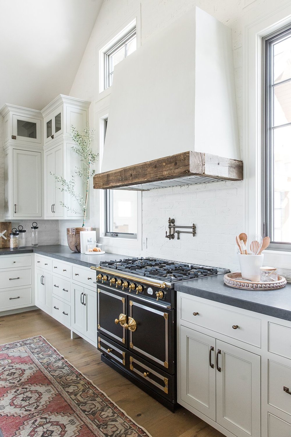
One Room Challenge- Week 2
Week 2 of our kitchen over here is in full swing and I wanted to share with you the design plan, a.k.a. the pretty or “fun” part before things get ugly, and then pretty again.
This is the 4th kitchen remodel we have done on our own home, and I am by far the most excited about it (which is good because we consider this our forever home!). Needless to say I have learned a few things about my personal style along the way. I have had 3 white kitchens, so I obviously LOVE THEM, but over the last couple of years I have really tried to hone in on what I am drawn to time and again. I want to choose selections for this home that are going to be timeless, but also more me rather than what is on trend. I started noticing I am drawn to European kitchens, and particularly Belgian kitchens. Details like light inset cabinetry, marble, black soapstone, unlacquered brass, plaster, reclaimed wood, zellige tiles, iron/steel, and wicker are are details and materials that speak to me in general.
For this kitchen, what I envisioned was light (but not white) inset cabinetry and dark or black countertops, and a black range:
Design by Jessica Helgerson
Design by Kathleen Walsh via Lonny
This may seem weird to some, but I don’t want any upper cabinetry. I love how a lot of European kitchens have either no uppers, or some open shelving. I also love their concept of open islands. We plan to do all three…some walls with open shelving, some walls with nothing, and an open island. I already found the perfect bowl to go on the island shelf and plan to fill it with vegetables. I want this to be a working kitchen and feel like it’s been around forever!
Via Lauren Liess
I’m also planning on a HUGE plastered range hood. One that sits on the counter and has slight curves with a reclaimed beam. Picture a mix of these:
Design by Block Brothers Cabinets via Rue Magazine
Since the range hood will come down on the countertop, we plan to only backsplash that area with square zellige tiles.
And depending on the scale of the hood and how it feels, I might throw in some wicker/rope pendants for over the island, or I may just leave a sconce above the sink and let the hood steal the show!
And last but not least, I hope to incorporate a pot rack on one of my open walls!
Via Nickey Kehoe
Hopefully that gives you an idea of the overall direction. Here is the mood board for the space:
Make sure to check back next week for more progress! And check out the other spaces here.
XO
Whitney


